Statistics 101 - Measuring Data
The first step in every statistical analysis is to determine whether the data is a population or a sample. A population is the entire set of all possible data values that are of interest in a study. It is usually denoted by the capital letter N. A sample is a population subset usually denoted by the letter n. Most of the time obtaining the whole population data is either impossible or would be extremely hard or expensive. Let’s say you want to gather data about students of a specific city or country. To get population data, you would need to contact all students on university campuses, all studying at home, all on the exchange, all part-time students, and so on. Instead, you can draw sample data which means you just contact randomly selected students.
Descriptive statistics are numbers (more formally: coefficients) used for a summary of available data. Together with data visualization, they form the basis of data analysis. You already know that available data usually means a sample. These numbers, obtained using a sample, are called statistics (the numbers based on the entire population are called parameters).
It’s important to distinguish descriptive statistics from inferential statistics. The latter is used to draw conclusions about the whole population based on its sample.
Types of Data
Having a good understanding of data types is crucial for choosing optimal statistics and visualization methods. At the highest level data can be divided into qualitative (categorical) and quantitative (numerical). Categorical data are data that cannot be represented with numbers (or at least not in mathematical meaning) such as brands of cars, gender, yes or no answer, etc. As its name suggests numerical data are numbers and in general any things that can be measured, such as height, weight, age, and so on.
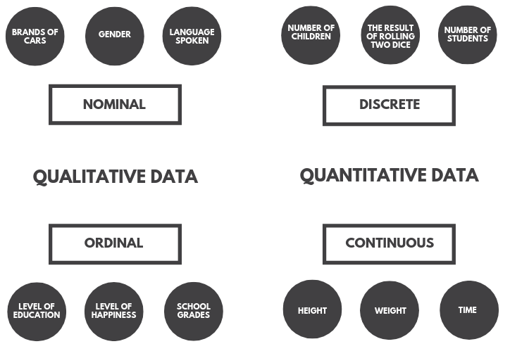
Quantitative data can additionally be divided into continuous and discrete. In general, discrete data can rather be counted than measured. A good example is the number of children one has - it definitely is an integer and there can only be some certain values like 0, 1, 2, … let’s say up to 15. Continuous data are measurements, for example, a person’s height, which can be represented on the real number line (it can take an infinite number of values).
Qualitative data can be split into nominal and ordinal data. Nominal values act as labels for variables with no quantitative value. For example, if there was a dataset of different car brands we could encode them as BMW = 0, Mercedes = 1, Toyota = 2, and so on. Notice however that these numbers do not represent any order. In the case of a yes or no question, it is also common to assign 0 or 1 values. Such a feature is called dichotomous (binomial) - a categorical data type with only two possible categories. Ordinal values on the other hand represent discrete ordered units. Their use is common in surveys. For example, the level of satisfaction could be measured on a scale from 1 (not satisfied at all) to 10 (extremely satisfied).
There are four common ways to describe a set of observations:
- measures of central tendency (location)
- measures of asymmetry
- measures of statistical dispersion (spread, scatter, variability)
- measures of statistical dependence (if more than one variable is measured)
Measures of Central Tendency: Mean, Median, Mode
Measures of central tendency attempt to describe a dataset by identifying its central or typical value. The most popular measures are arithmetic mean (average), median and mode.
The arithmetic mean is equal to the sum of all values in a dataset divided by the number of these values. If there are \(n\) values in a dataset, then the sample mean formula is:
\[\bar{x} = \frac{x_1 + x_2 + ... + x_n}{n}\]or equivalently:
\[\bar{x} = \frac{\sum_{i=1}^{n} x_i}{n}\]The presented formula refers to the mean of a sample. It is important to be aware of whether a statistic is calculated for a sample or for a population. If you had the entire population data, you would be 100% sure of the calculated measure, while the number calculated from a sample is an approximation of the population parameter. Some formulas are specifically adjusted for the calculation of the population statistic. In the case of the mean, the formula for a population is:
\[\mu = \frac{x_1 + x_2 + ... + x_N}{N}\] \[\mu = \frac{\sum_{i=1}^{N} x_i}{N}\]Technically it is a different formula (it uses different notation), but the statistic is computed in the same way. Later you will see statistics that have different formulas and are computed in different ways for sample and population.
One main disadvantage of the mean is that it is heavily affected by outliers (data points that significantly differ from other observations, i.e. are unusually small or large).
The second measure of central tendency is the median. To calculate the median you need to order the dataset in ascending order and take the value on the middle position (or a mean of values on two middle positions in case of an even number of observations). Unlike the mean, the median is not affected by outliers.
The last popular measure is the mode. It is the value that occurs most often in a dataset. It is the only central tendency measure that can be used with nominal data.
There is no single rule as to when particular statistics should be used. If there are a lot of outliers in a dataset, the median or mode should be used (median usually preferred). Nominal data can have only a mode (and sometimes it doesn’t even have that). The mean is preferred when the data distribution is continuous and symmetrical.
Measures of Asymmetry: Skewness and Kurtosis
The most common tool for measuring asymmetry is skewness. It is a degree of distortion from the normal distribution. Skewness basically says where the observations are concentrated.
The sample skewness formula is:
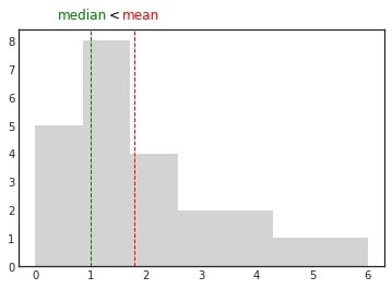
\[\frac{\frac{1}{n}\sum_{i=1}^{n}(x_i-\bar{x})^3}{\sqrt{\frac{1}{n-1}\sum_{i=1}^{n}(x_i-\bar{x})^2}^3}\]If the mean is greater than the median, the data is positively skewed or right-skewed. When you plot the distribution of such data, you can see that most observations are clustered around the left tail and the right tail is longer. The name of the skew may seem counterintuitive. Remember that this name does not indicate where the majority of observations are, but rather to which side the tail is leaning (on which side the outliers are).
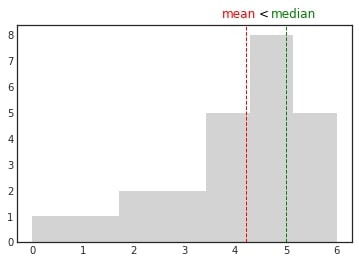
If the median is greater than the mean, the data is negatively skewed or left-skewed. When you plot the distribution of such data, you can see that most observations are clustered around the right tail and the left tail is longer.
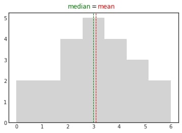
In normally distributed data all measures of central tendency are equal. There is no or zero skew.
The results of the skewness formula presented at the beginning of this section are:
- zero for symmetrical distributions
- less than zero for left-skewed distributions
- greater than zero for right-skewed distributions
There is also a rule according to which:
- data with skewness between -0.5 and 0.5 are rather symmetrical
- data with skewness between -1 and -0.5 (left-skewed) or 0.5 and 1 (right-skewed) are moderately skewed
- data with skewness lower than -1 (left-skewed) or greater than 1 (right-skewed) are highly skewed
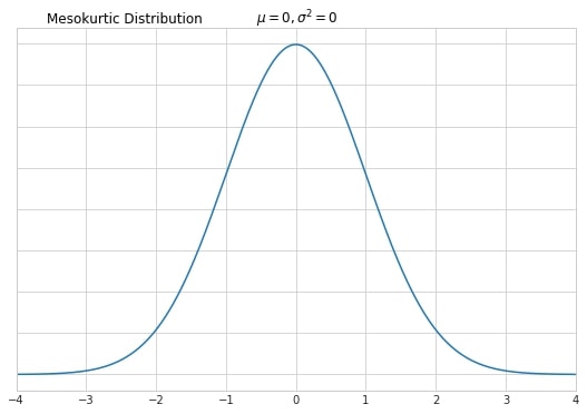
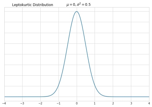
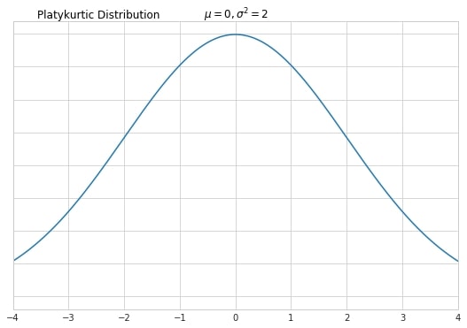
Kurtosis is a measure of the number of outliers in a distribution. Graphically various kurtosis types are represented by the thickness of distribution’s tails in relation to its overall shape. All kurtosis types are compared against a standard normal distribution.
Normal distribution when graphed as a histogram is bell-shaped and has most of the data within +/- three standard deviations from the mean. This type of distribution is called mesokurtic.
High kurtosis indicates that there are a lot of outliers in the dataset. This type of distribution is called leptokurtic. It’s usually identified by a thin and tall peak (however, it is important to remember that kurtosis is defined by tails, not peaks!)
Finally, low kurtosis indicates that there are none or not many outliers. This type of distribution is called platykurtic. Oftentimes it has a lower peak than this of normal distribution.
Measures of Variability: Variance, Standard Deviation, Coefficient of Variation
The variance measures the dispersion of data points around their mean value. For the population, it is equal to the sum of squared differences between the observed values and their mean divided by the total number of observations:
\[\sigma^2 = \frac{\sum^N_{i=1}(x_i-\mu)^2}{N}\]Sample variance is computed in a slightly different way. The sum of squared differences is divided by the number of observations minus 1.
\[S^2 = \frac{\sum^n_{i=1}(x_i-\bar x)^2}{n-1}\]The closer to the mean the data points are, the smaller the differences will be, therefore the smaller variance. Taking the square value of the differences has two purposes. First of all, you will always get non-negative computations (variance is about the distance and intuitively the distance cannot be a negative value). Secondly, squaring amplifies the effect of large differences.
The standard deviation is a square root of the variance.
\[\sigma = \sqrt{\sigma^2}\] \[S = \sqrt{S^2}\]Standard deviation is way more frequently used by data analysts. The reason is that its units are the same as the units of the underlying data (e.g. before I’ve written about X standard deviations from the mean when kurtosis was presented). Variance is only useful thanks to its convenient mathematical formula and easy computation.
If you want to compare the variability of two separate datasets, the standard deviation is useless. Instead, use the coefficient of variation (or relative standard deviation). It is calculated by dividing the standard deviation of a dataset by its mean.
\[c_v = \frac{\sigma}{\mu}\] \[\hat {c_v} = \frac{S}{\bar x}\]Let’s consider an example:
| Price in EUR | Price in HUF | EUR | HUF | ||
|---|---|---|---|---|---|
| 1 | 325.37 | Mean | 5.50 | 1789.51 | |
| 2 | 650.73 | Sample variance | 9.17 | 970411.14 | |
| 3 | 976.10 | Sample standard deviation | 3.03 | 985.09 | |
| 4 | 1301.46 | Sample coefficient of variation | 0.55 | 0.55 | |
| 5 | 1626.83 | ||||
| 6 | 1952.20 | ||||
| 7 | 2277.56 | ||||
| 8 | 2602.93 | ||||
| 9 | 2928.29 | ||||
| 10 | 3253.66 |
The first column consists of some random prices in EUR. The second column consists of the same prices expressed in HUF (where the exchange rate is 325,37 HUF for 1 EUR). Due to HUF values being larger in general, the mean, variance and standard deviations for these data points are much greater than those for EUR. However, the coefficient of variation is the same for both datasets! Knowing this, we can say that both datasets have the same variability (which was obviously expected).
Measures of Dependence: Covariance and Correlation
Measures of dependence should be considered when we are working with more than one variable. We say that two variables are related when changes in one variable coexist with changes in the other variable. Such relationships can be positive - as one variable goes up, the other also goes up or negative - when one goes up, the other goes down. Bigger houses are more expensive (positive relationship). When prices of some goods go up, people tend to buy more of other (substitute) goods (negative relationship).
Relationships can be linear which means a straight line can be used to show the relationship between variables or nonlinear. Strong relationships can be described using relatively simple mathematical formulas, while weak relationships might require more complicated ones.
Covariance is the main statistic for measuring the correlation between variables. It may be positive, negative, or equal to zero. Sample and population formulas are as follows:
\[S_{xy} = \frac{\sum^n_{i=1}(x_i - \bar x)(y_i - \bar y)}{n-1}\] \[\sigma_{xy} = \frac{\sum^N_{i=1}(x_i - \mu_x)(y_i - \mu_y)}{N}\]Covariance gives a sense of the direction:
- cov(x,y) > 0 means the two variables move in the same direction
- cov(x,y) < 0 means the two variables move in opposite directions
- cov(x,y) = 0 means the variables are independent
It does not indicate the strength of the relationship between variables. For this, we have the correlation coefficient. Correlation adjusts covariance so that the interpretation of the relationship between variables becomes easy and intuitive. It is computed by dividing covariance by the product of standard deviations of the two variables. Formulas for the sample and the population are:
\[r_{X,Y} = \frac{S_{xy}}{S_x S_y}\] \[\rho_{X,Y} = \frac{\sigma_{xy}}{\sigma_x \sigma_y}\]Correlation values fall in the range of \([-1, 1]\). A correlation equal to \(1\) is known as a perfect positive correlation. In such a case we say that the entire variability of one variable is explained by the other variable. A correlation of \(0\) means the two variables are absolutely independent from each other. Correlation of \(-1\) is called a perfect negative correlation.
If the correlation coefficient falls in the range of \((0,1)\) we will say there is an imperfect positive correlation and in the range of \((-1,0)\) \(-\) imperfect negative correlation.
Both formulas, for the correlation and the covariance, are symmetrical with respect to both variables, i.e. the correlation/covariance between variables \(X\) and \(Y\) is the same as the correlation/covariance between variables \(Y\) and \(X\).
Finally, it is important to remember that the correlation does not imply causation. In causal relationships, the change in one variable causes the change in the second variable, but the opposite is not true.
Presented measures are basic ones used in descriptive statistics. There are obviously more. However, mastering the use of what the article describes is already a pretty strong data analyst skill set.